Our Design Process

A military family reunited at a San Diego air base. An adult learner wearing a wide smile and a cap and gown. A woman with disabilities standing proudly in front of her state capitol building.
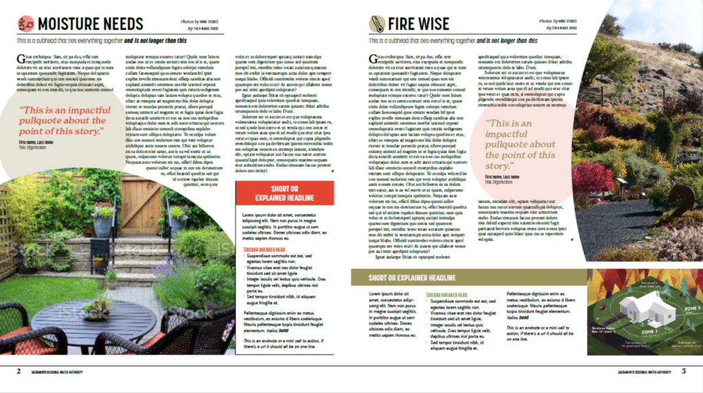
Media research tell us people are more inclined to pick something up and read it if it is visually appealing. Our publications include a compelling cover, striking photographs, graphics that pop, interesting colors and attractive fonts. At N&R Publications, our talented Design team uses these visual elements to make the publication something people want to grab, browse and dive deeply into in a way they might not otherwise. The art and icons that accompany the stories are original, unique and get your message across to readers in a way that words alone never could.
Lead designer Kate Mitrano on her design process:
“When coming up with a design for a publication, my first go-to is reading the notes that our editors put together after the storyboard meeting with a new client. This very useful information helps us get an idea of the purpose of the publication. An example of something we look for is tone – is the overall mood of the publication supposed to be serious or friendly? It entirely depends on the subject matter, and that’s where reading the editor’s notes from beginning to end can really help.
Sometimes, the editor will leave notes about the client’s design preferences that give me clues into what the actual aesthetic will be. For instance, a client may like a specific style and can request that from us. But more often than not, I will look at the client’s website and draw inspiration from their online presence. I will scan the whole website looking for color palettes, design elements, and typefaces used. We look at what kinds of photos they use so we (the designers) know what to look for when selecting photography.

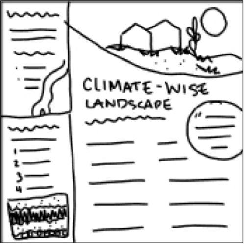
After taking a good look at the website, I gather my screenshots of colors and logos and start creating a sample page. My first action item is coming up with a color palette. After selecting colors, I then move on to the typeface. The color palette and typefaces set up the whole tone of the publication, so it is crucial to get these right so that the reader will receive the intended message with just a glance. I model the sample page as closely as possible to the content that I think will appear in the publication, and once it is complete, we create quick rough sketch mock-ups of what each page in the publication may look like.
This whole process is what helps the designers model the entire publication later on.”
In a world that has become increasingly visual, a well-designed, visually appealing publication will get your message noticed because people will want to read it.